lokithelion Posted January 14, 2009 Share Posted January 14, 2009 The second one looks like the text of every generic metalcore/screamo promo i've gotten in four years of writing for a zine. Use the first. Quote Link to comment Share on other sites More sharing options...
keymanmk Posted January 14, 2009 Share Posted January 14, 2009 i like the font of the 2nd better, but i think it should be larger Quote Link to comment Share on other sites More sharing options...
kidamnesiac Posted January 14, 2009 Author Share Posted January 14, 2009 The response is overwhelmingly. (13-6) in favor of the first design. Thanks guys. I'm excited to see how these turn out. I'll let all of you know when they're finished. i would like to screen to these.www.iheartuproductions.com Thanks, but what do you mean good sir? Your site looks like you only make shirts and the like... Quote Link to comment Share on other sites More sharing options...
xlovecolouredx Posted January 14, 2009 Share Posted January 14, 2009 the first one.... Quote Link to comment Share on other sites More sharing options...
melikecheese Posted January 14, 2009 Share Posted January 14, 2009 1 script lettering for band names sucks ass. Quote Link to comment Share on other sites More sharing options...
bigmonkey Posted January 14, 2009 Share Posted January 14, 2009 The response is overwhelmingly. (13-6) in favor of the first design. Thanks guys. I'm excited to see how these turn out. I'll let all of you know when they're finished.i would like to screen to these.www.iheartuproductions.com Thanks, but what do you mean good sir? Your site looks like you only make shirts and the like... Eric will screen CDs, not to mention a lot of other stuff. If you shaved your head and held still long enough, he'd probably screen your scalp. Quote Link to comment Share on other sites More sharing options...
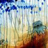
kidamnesiac Posted January 15, 2009 Author Share Posted January 15, 2009 Just got an email from my guitarist with this mock up of what the CD will look like. And I'm digging the font a lot more now. What do you guys think? Yeah I agree that the distressed scripty font is stereotypical emo/screamo bullshit, but we already have shirts with the font on it designed by my guitarist and I guess consistency isn't a bad thing. Quote Link to comment Share on other sites More sharing options...
Guest vito Posted January 15, 2009 Share Posted January 15, 2009 i like the font of the 2nd better, but i think it should be larger Quote Link to comment Share on other sites More sharing options...
crossedoff Posted January 15, 2009 Share Posted January 15, 2009 The second one looks like the text of every generic metalcore/screamo promo i've gotten in four years of writing for a zine. Use the first. if either of the texts is generic its the first one, IMO Quote Link to comment Share on other sites More sharing options...
murgorgoroth Posted January 15, 2009 Share Posted January 15, 2009 second one nice cover art btw Quote Link to comment Share on other sites More sharing options...
monk0nuggets Posted January 15, 2009 Share Posted January 15, 2009 I like the second because the font goes with the vine/tentacle type things. Quote Link to comment Share on other sites More sharing options...


Recommended Posts
Join the conversation
You can post now and register later. If you have an account, sign in now to post with your account.
Note: Your post will require moderator approval before it will be visible.