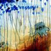
kidamnesiac Posted January 14, 2009 Share Posted January 14, 2009 Thanks for all the help so far, guys. My band, To Russia, is doing a small run of CDs (50 for now). We decided to get silver CDs with screened art on them in clear vinyl sleeves. You'll have to imagine these with the corners cut off, as it will be sized down to fit on the disc, but which version of the following art do you like better? This was the first version I did, and I'm rather fond of the font choice. Joey, my guitarist, prefers the font we currently use on our Myspace for it's similarity to the octopus tentacles and thinks it will look better on the round surface of the compact discs. But WHAT DO YOU THINK? Quote Link to comment Share on other sites More sharing options...
username Posted January 14, 2009 Share Posted January 14, 2009 the first one Quote Link to comment Share on other sites More sharing options...
roadmonkey Posted January 14, 2009 Share Posted January 14, 2009 kinda like the second one a little better Quote Link to comment Share on other sites More sharing options...
Guest conoley Posted January 14, 2009 Share Posted January 14, 2009 2 Quote Link to comment Share on other sites More sharing options...
mynameisdan Posted January 14, 2009 Share Posted January 14, 2009 i think the second font sounds like your band. but i think the first one is cooler. if that makes sense to you. Quote Link to comment Share on other sites More sharing options...
crossedoff Posted January 14, 2009 Share Posted January 14, 2009 i like the font of the 2nd better, but i think it should be larger Quote Link to comment Share on other sites More sharing options...
goraiders Posted January 14, 2009 Share Posted January 14, 2009 i think the second font sounds like your band. but i think the first one is cooler. if that makes sense to you. this Quote Link to comment Share on other sites More sharing options...
jhulud Posted January 14, 2009 Share Posted January 14, 2009 i like the font of the 2nd better, but i think it should be larger Quote Link to comment Share on other sites More sharing options...
murakami Posted January 14, 2009 Share Posted January 14, 2009 i like the first, it looks like a logo that could go with any art. the 2nd seems to be more specific to that drawing. Quote Link to comment Share on other sites More sharing options...
cadetapplesauce Posted January 14, 2009 Share Posted January 14, 2009 i think i like the second one better. the first kinda sticks out like a sore thumb. Quote Link to comment Share on other sites More sharing options...
eddieruckus Posted January 14, 2009 Share Posted January 14, 2009 1 Quote Link to comment Share on other sites More sharing options...
cj Posted January 14, 2009 Share Posted January 14, 2009 i like the top one. the block letters seem like crumbling and thats what russia is all about Quote Link to comment Share on other sites More sharing options...
sgoodcore Posted January 14, 2009 Share Posted January 14, 2009 I like the first one without the Tiger. Quote Link to comment Share on other sites More sharing options...
controlthebleeding Posted January 14, 2009 Share Posted January 14, 2009 While the 2nd font mixes in with the picture well, the 1st font calls more attention to the Band Name. Personally i don't like the layout of the fonts though... then again, with everything else in kind of a montage, may having the text be a bit off center would help out a bit.. just a thought. Quote Link to comment Share on other sites More sharing options...
flatlinemole Posted January 14, 2009 Share Posted January 14, 2009 the first one Quote Link to comment Share on other sites More sharing options...
mrsquaresville Posted January 14, 2009 Share Posted January 14, 2009 I'm gunna go ahead and say numero one. Quote Link to comment Share on other sites More sharing options...
mattisr1984 Posted January 14, 2009 Share Posted January 14, 2009 if you want the band name to stand out, then go w/ number 1. if you want it to get lost in the design, then do number 2. Quote Link to comment Share on other sites More sharing options...
controlthebleeding Posted January 14, 2009 Share Posted January 14, 2009 if you want the band name to stand out, then go w/ number 1. if you want it to get lost in the design, then do number 2. exactly Quote Link to comment Share on other sites More sharing options...
rtw88 Posted January 14, 2009 Share Posted January 14, 2009 First one for sure. Quote Link to comment Share on other sites More sharing options...
pjaicomo Posted January 14, 2009 Share Posted January 14, 2009 1st Quote Link to comment Share on other sites More sharing options...
kurtz Posted January 14, 2009 Share Posted January 14, 2009 the first one Quote Link to comment Share on other sites More sharing options...
toymakanik Posted January 14, 2009 Share Posted January 14, 2009 2 Quote Link to comment Share on other sites More sharing options...
Snaggle Von Swift Posted January 14, 2009 Share Posted January 14, 2009 1st. Quote Link to comment Share on other sites More sharing options...
ericheartsu Posted January 14, 2009 Share Posted January 14, 2009 i like one. also, i would like to screen to these. www.iheartuproductions.com Quote Link to comment Share on other sites More sharing options...
Duff Posted January 14, 2009 Share Posted January 14, 2009 i like the first one better. it stands out from the artwork more. Quote Link to comment Share on other sites More sharing options...


Recommended Posts
Join the conversation
You can post now and register later. If you have an account, sign in now to post with your account.
Note: Your post will require moderator approval before it will be visible.